

003: High Contrast Living
When visual intrigue comes down to simple science.

This week, I have been ruminating on how we cultivate visual intrigue within the confines of a neutral palette. These spiraling thoughts have led me to a handful of possibilities, but the most seamless—and the most efficient to integrate into an existing space—is, of course, contrast.
It’s simple science: the human eye is instinctively drawn to difference. In a blur of soft tones, all too common in our modern dwellings, the introduction of a darker object offers the gaze relief—even pleasure. Distinctive tones or textures forge the hierarchy and rhythm of a room, anchoring the composition and guiding one’s view.
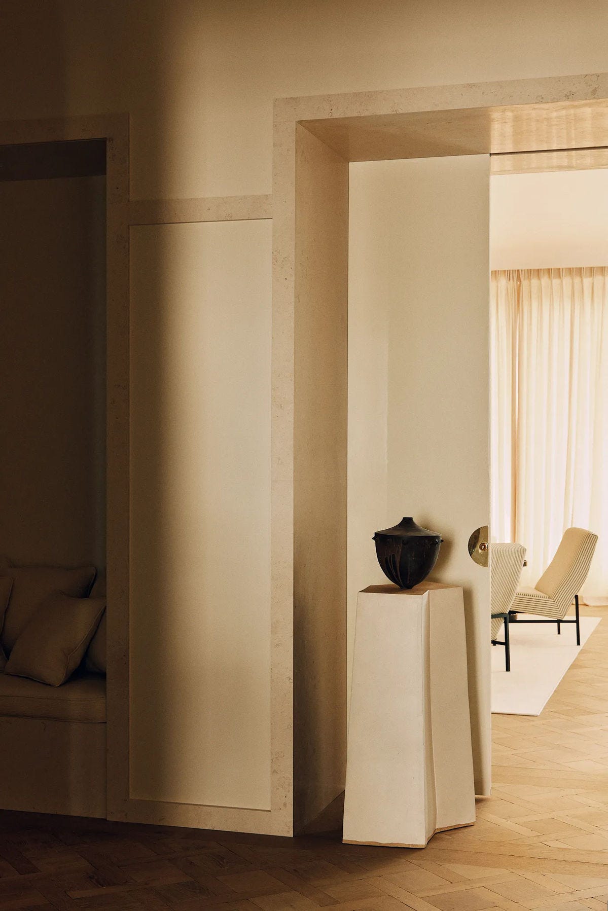
Looking at this image, the eye is instantly drawn to the black ceramic before being drawn to the interior room by the visual effect of the striped chairs, with black accents.
Material can be as powerful as color. Chrome and steel, for instance, provide contrast as effectively as black wood or leather. In our home, we use these distinctions sparingly, as punctuation rather than abundance. A black leather and chrome Le Corbusier couch and a secondhand mirrored cube table sourced on Etsy offer reprieve against white walls, sand-colored carpet, and wooden floorboards.
In the dining room, the black accents of our Prouvé table and Mies van der Rohe chairs carry the weight of definition within an otherwise soft space. Elsewhere, the work is done by black ceramics, antique wooden bowls, silver frames, or steel lamps—quiet accents that lend depth to vignettes.
In summary, my thought is this: when it comes to design, contrast is not merely synonymous with opposition, but balance. It is the interplay of material, colour and form that allows each to be realised—in relief against the others. Each element rendered more visually compelling, more essential to the framework of the space when positioned in counterbalance.
Moving away from the clinical austerity of all white or the flattening effect of endless beige, contrast remains one of the most effective tools for designing spaces that are calm yet compelling—without the burden of jarring palettes that may, after a few short months, fatigue the eye. All that to say, I think the simplest place to start is with a vase, lamp or chair to bring initial intrigue to even the most minimal space.
Thoughts?
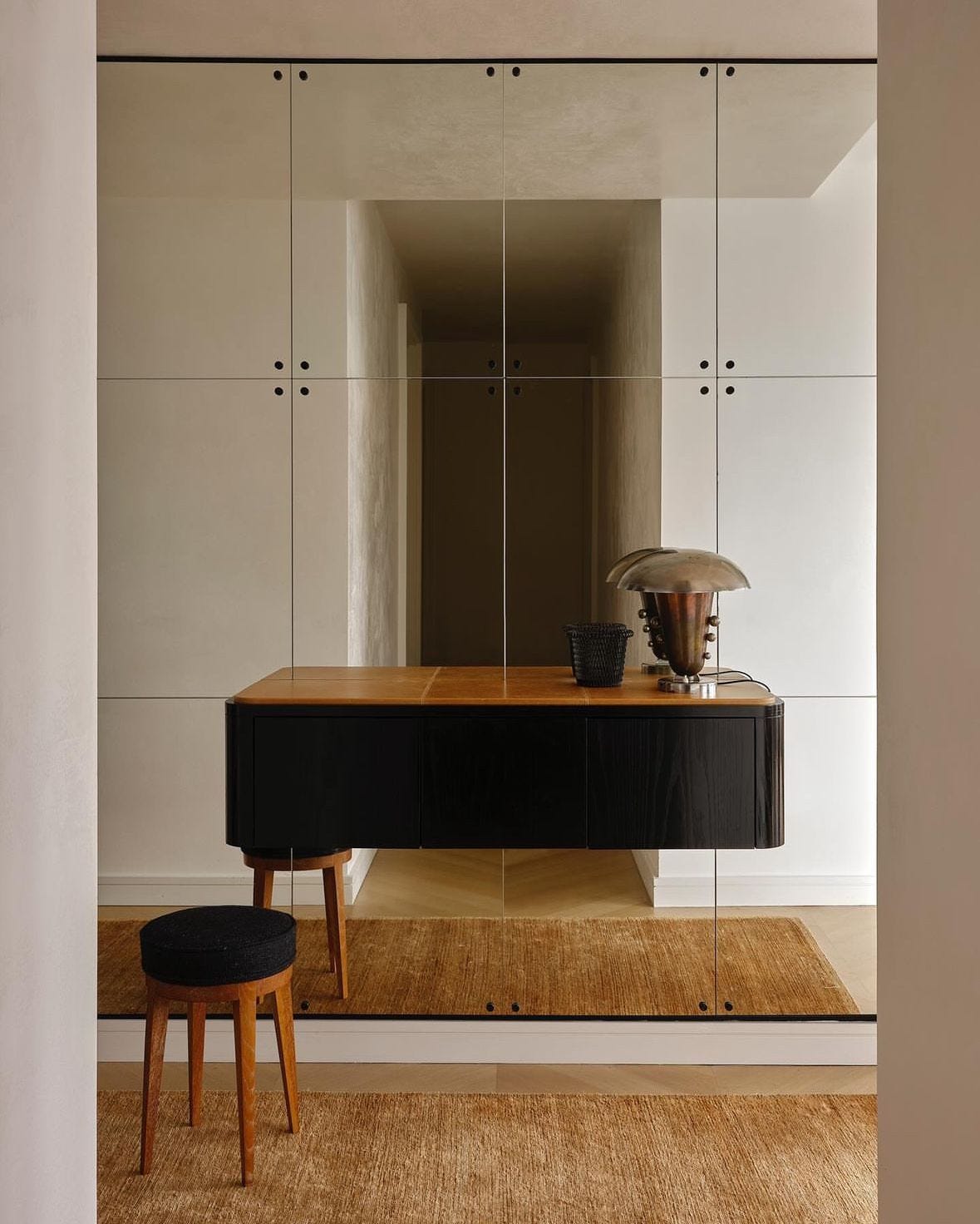
The same can be said for what we choose to wear. You write with such clarity.